Casa La Caleta
Branding + Visual Identity
Illustration
Typography & color system
Merchandise
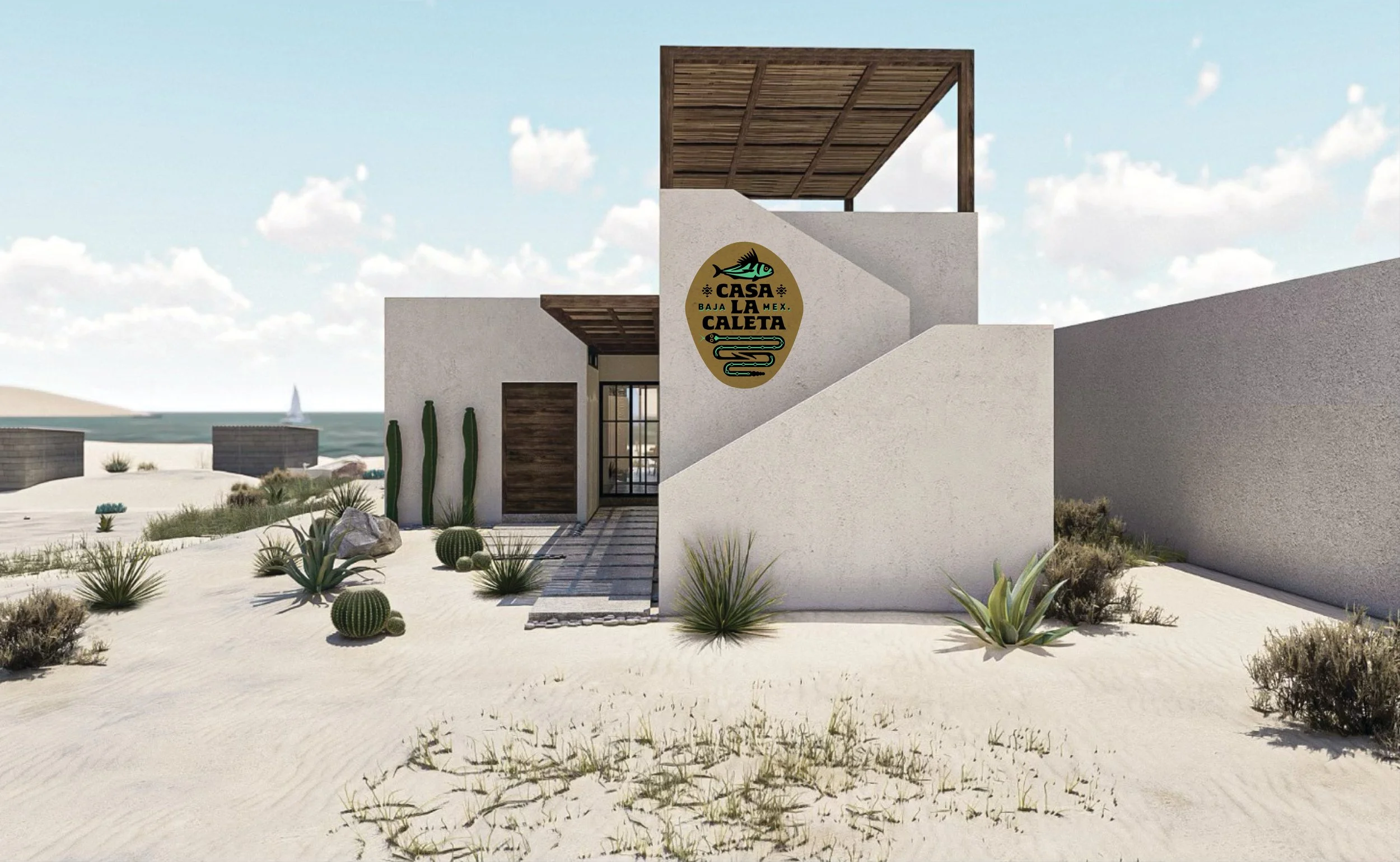
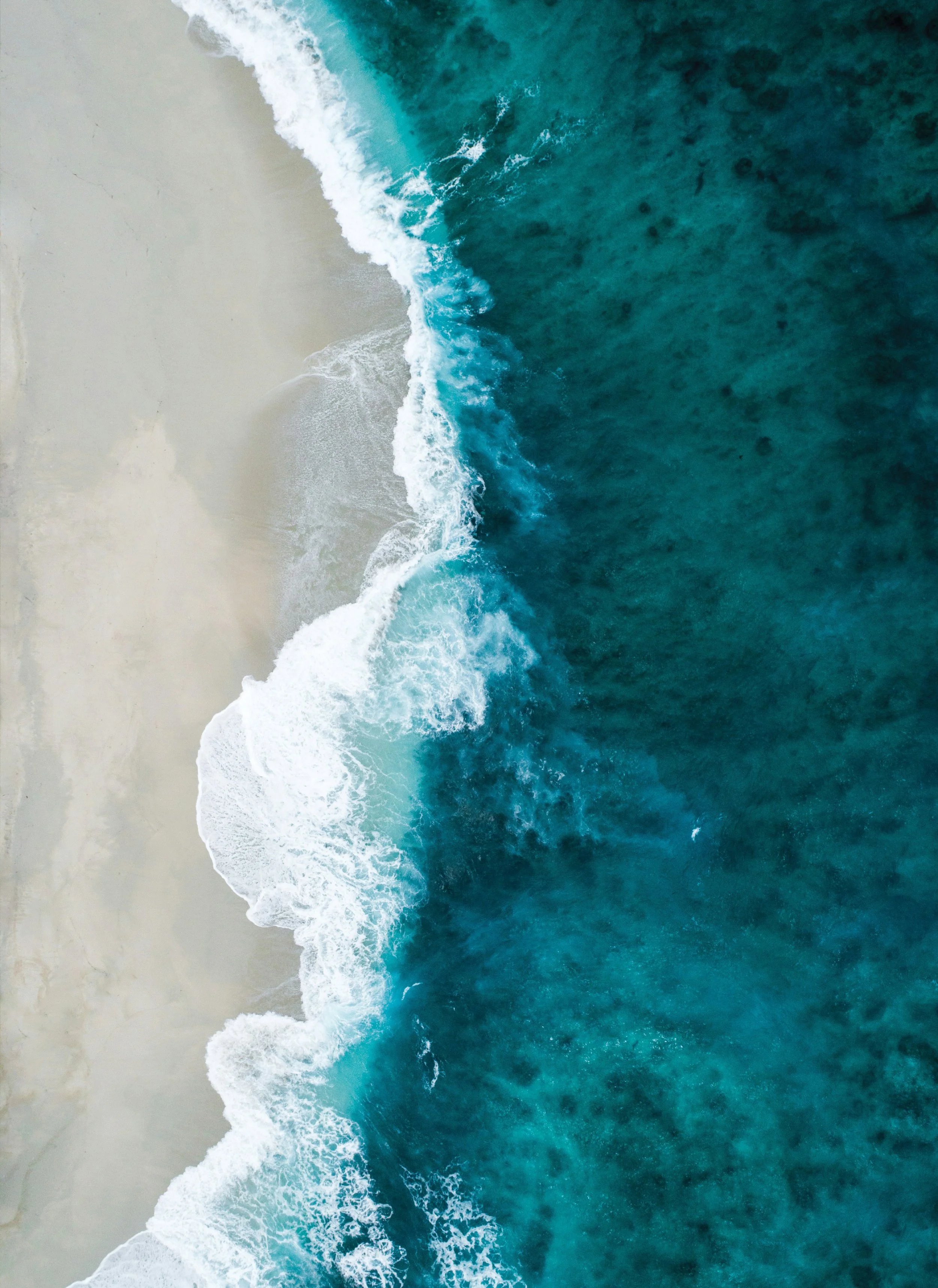
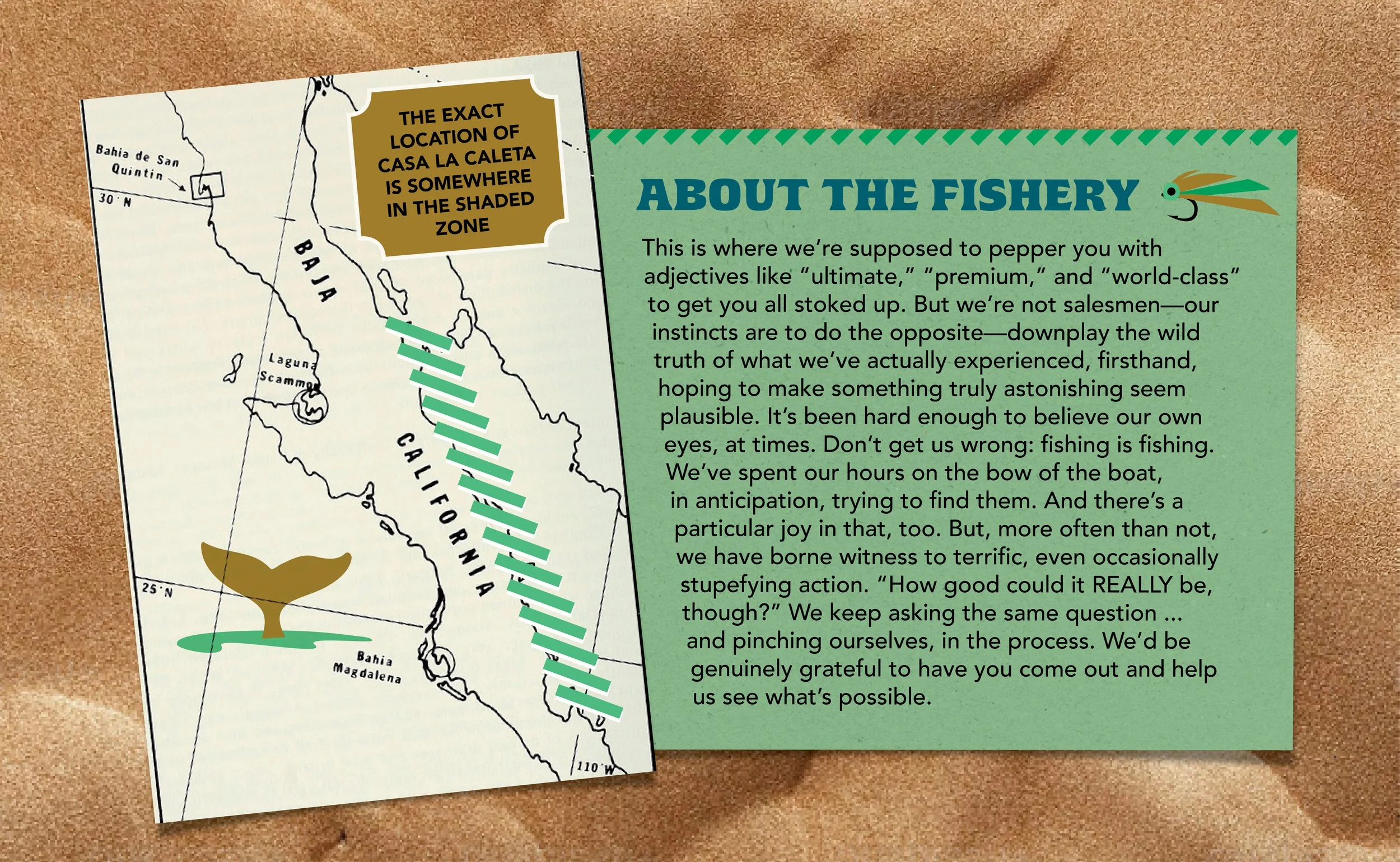
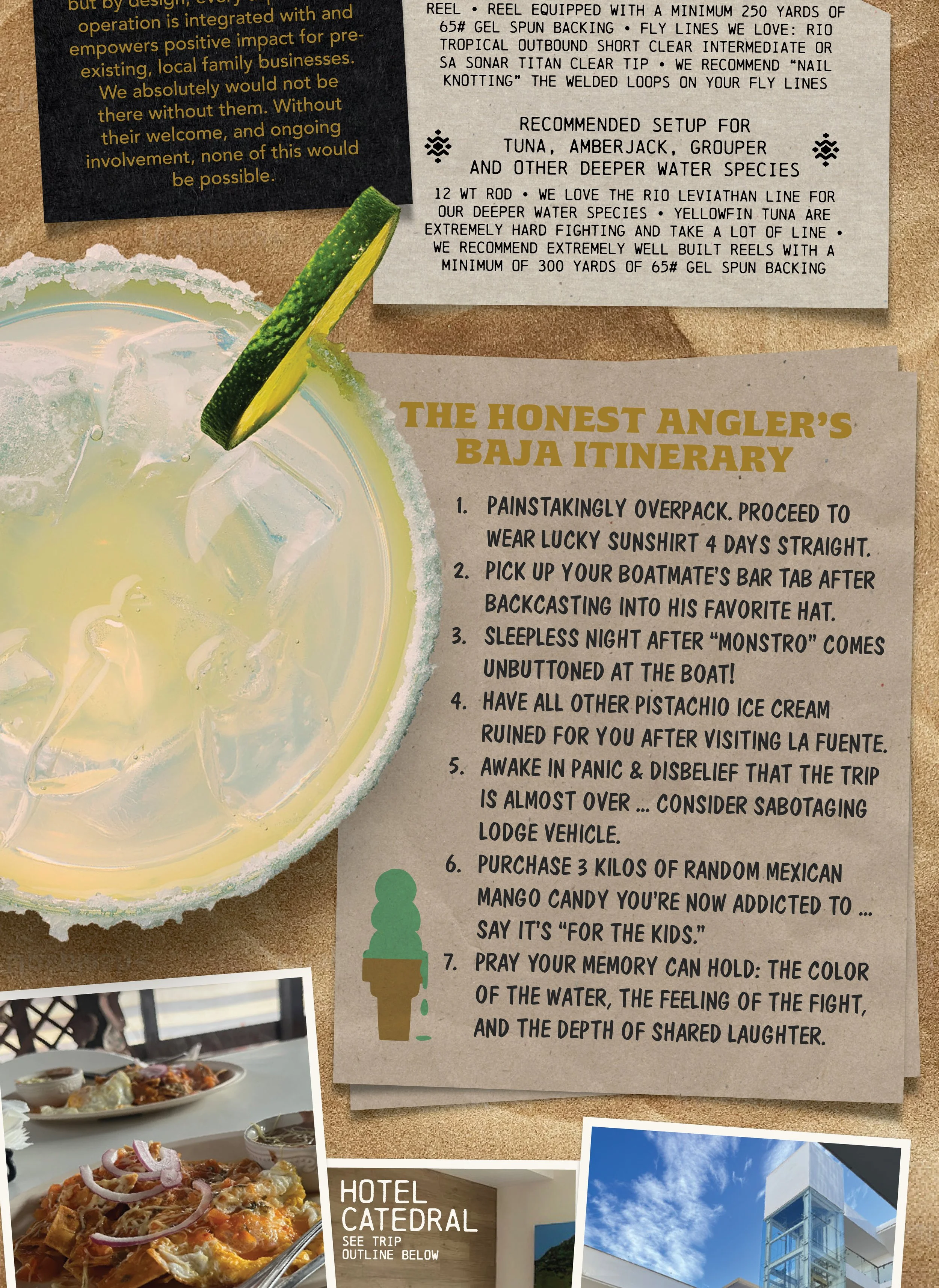
Casa La Caleta is an exclusive, invite-only fly fishing lodge located near the boundary waters of Baja’s legendary East Cape. Set along a sweeping stretch of untouched coastline, the lodge offers access to a pristine fishery brimming with life and opportunity—surpassed only by the warmth and hospitality of the local community that calls this place home. Anglers journey here in pursuit of one legendary species above all: the famed roosterfish—el gallo, as it’s known locally. And at Casa La Caleta, the roosterfish are not only present—they’re abundant. Casa La Caleta offers amazing fishing in a beautiful location, features top notch accommodation, embraces its local community, and invites those with a sense of adventure to enjoy its waters.
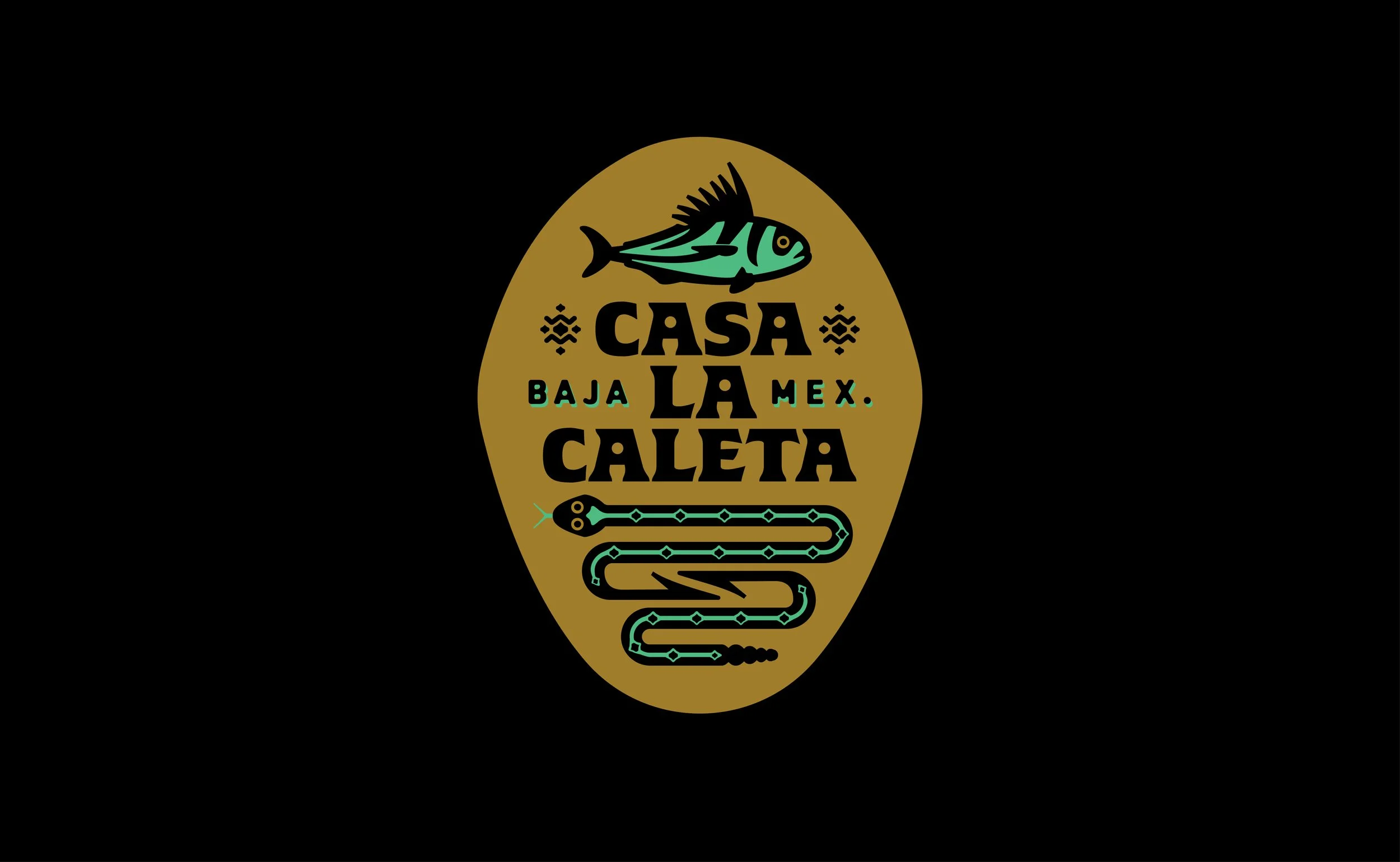
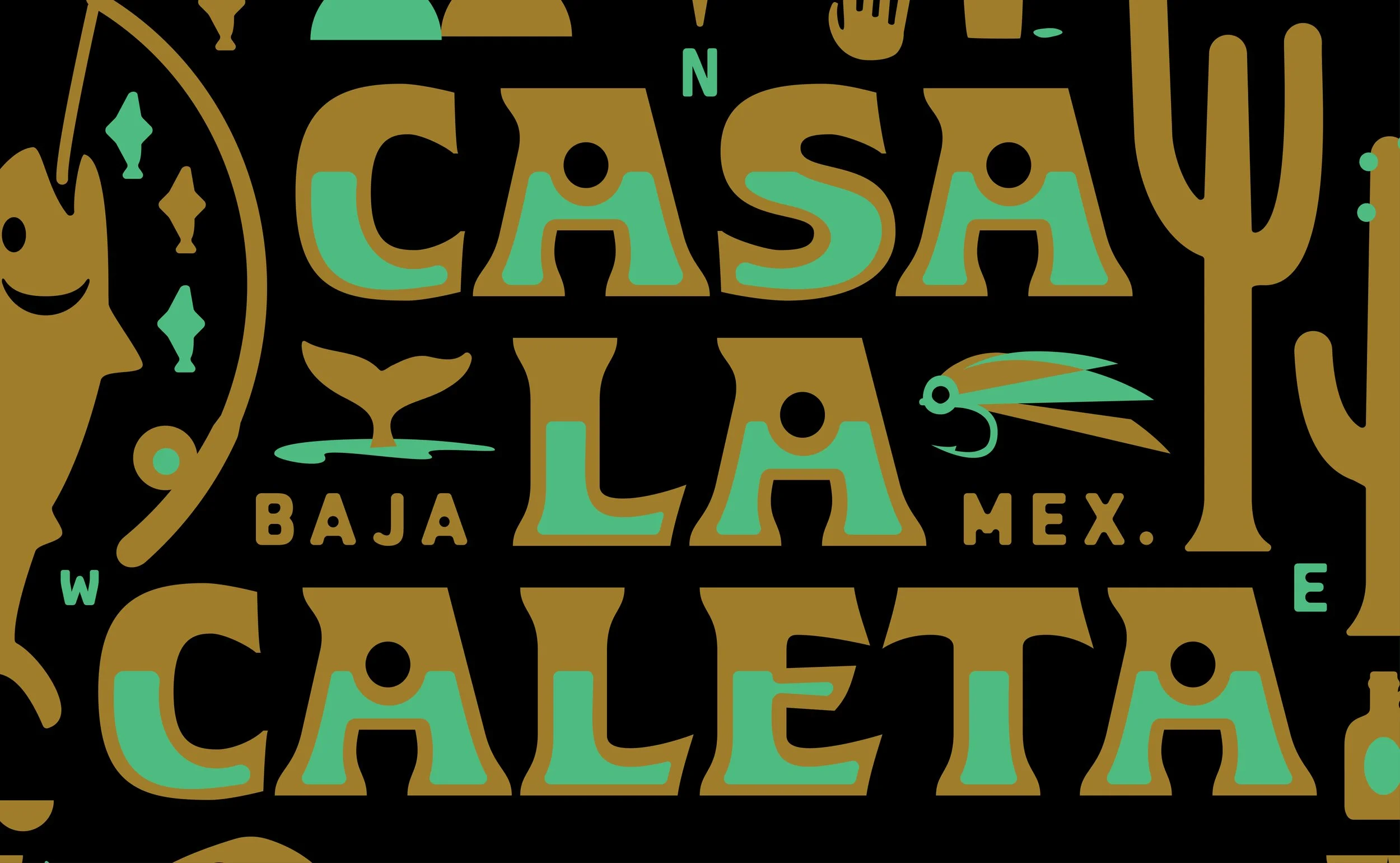
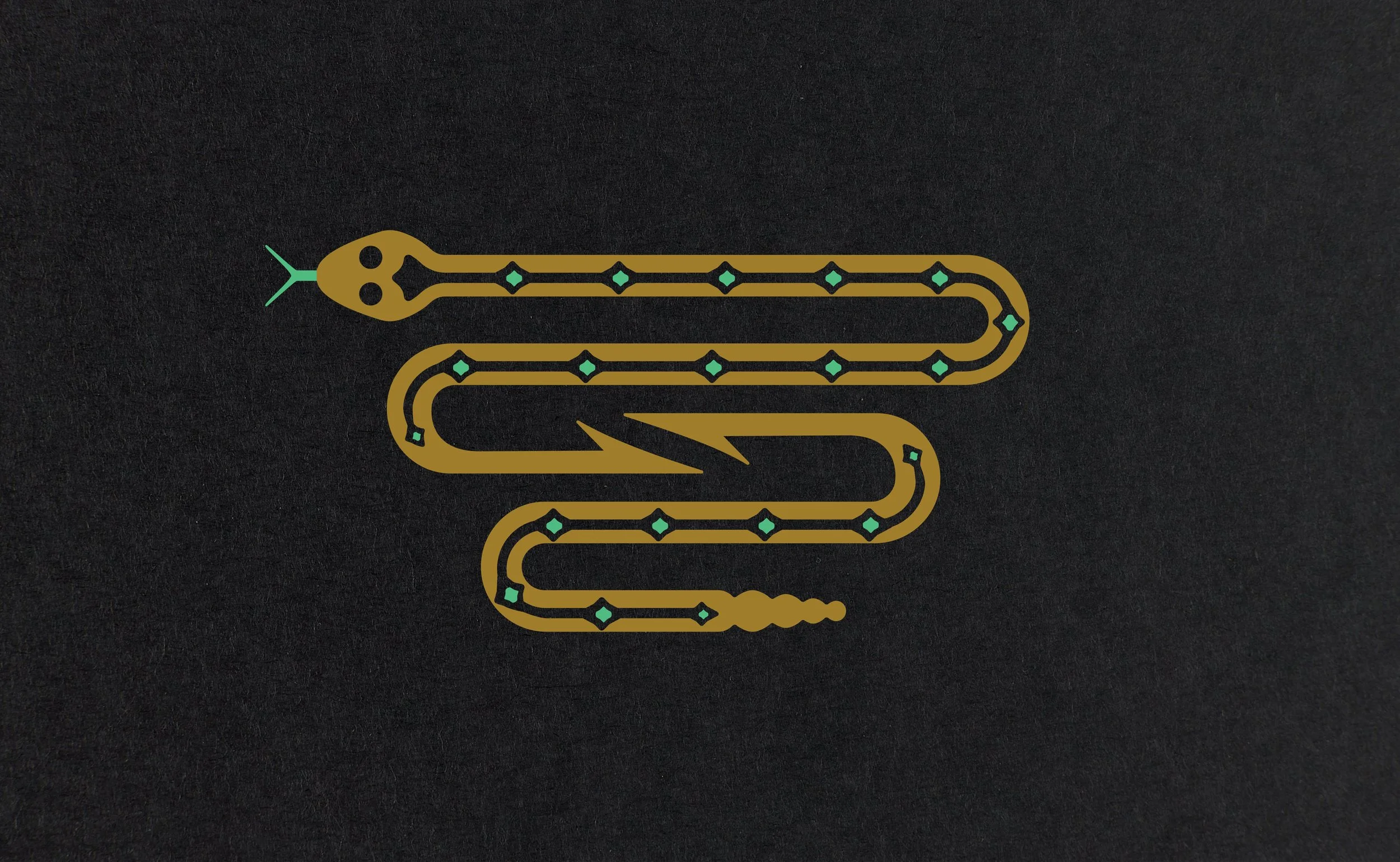
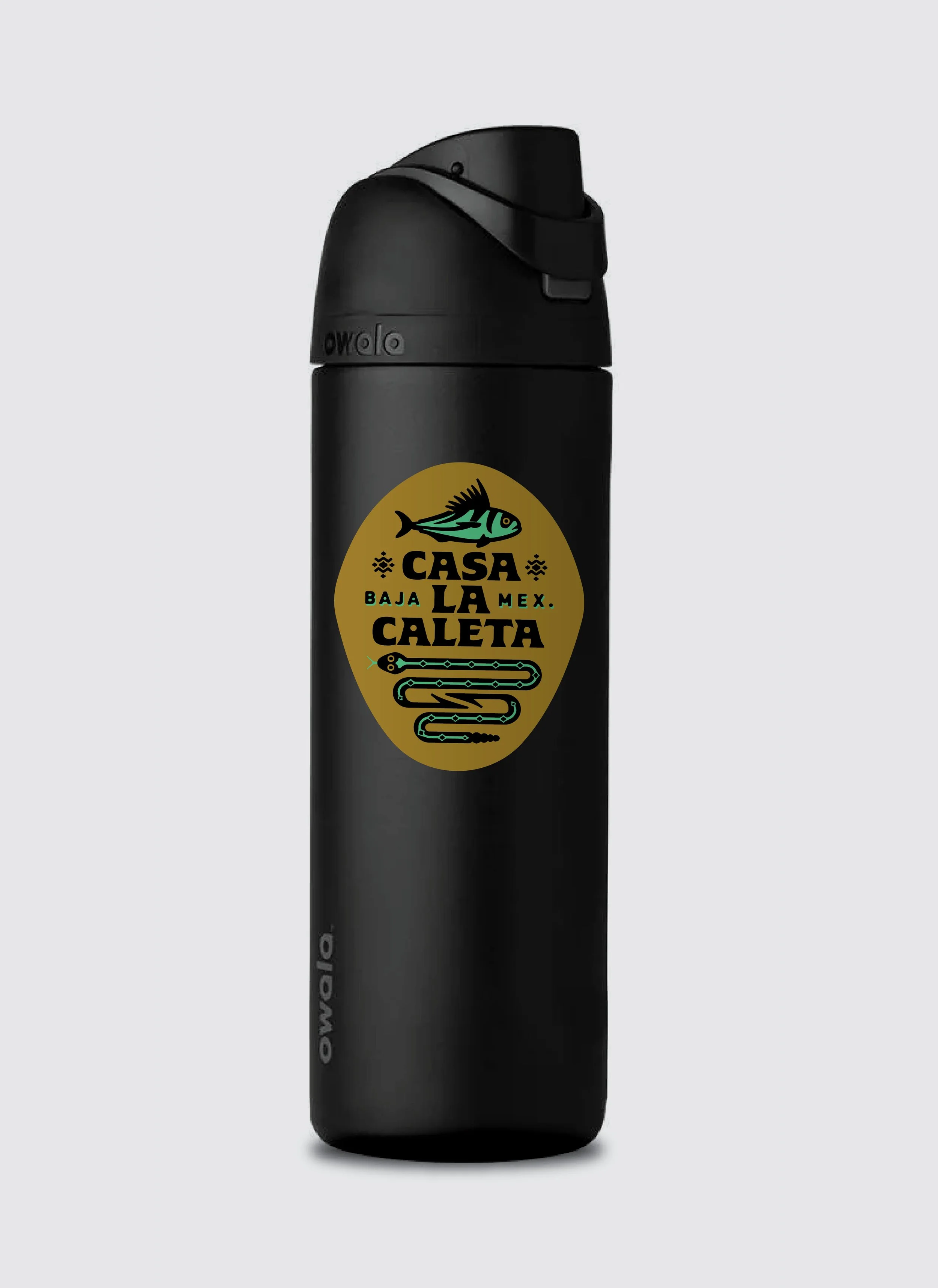
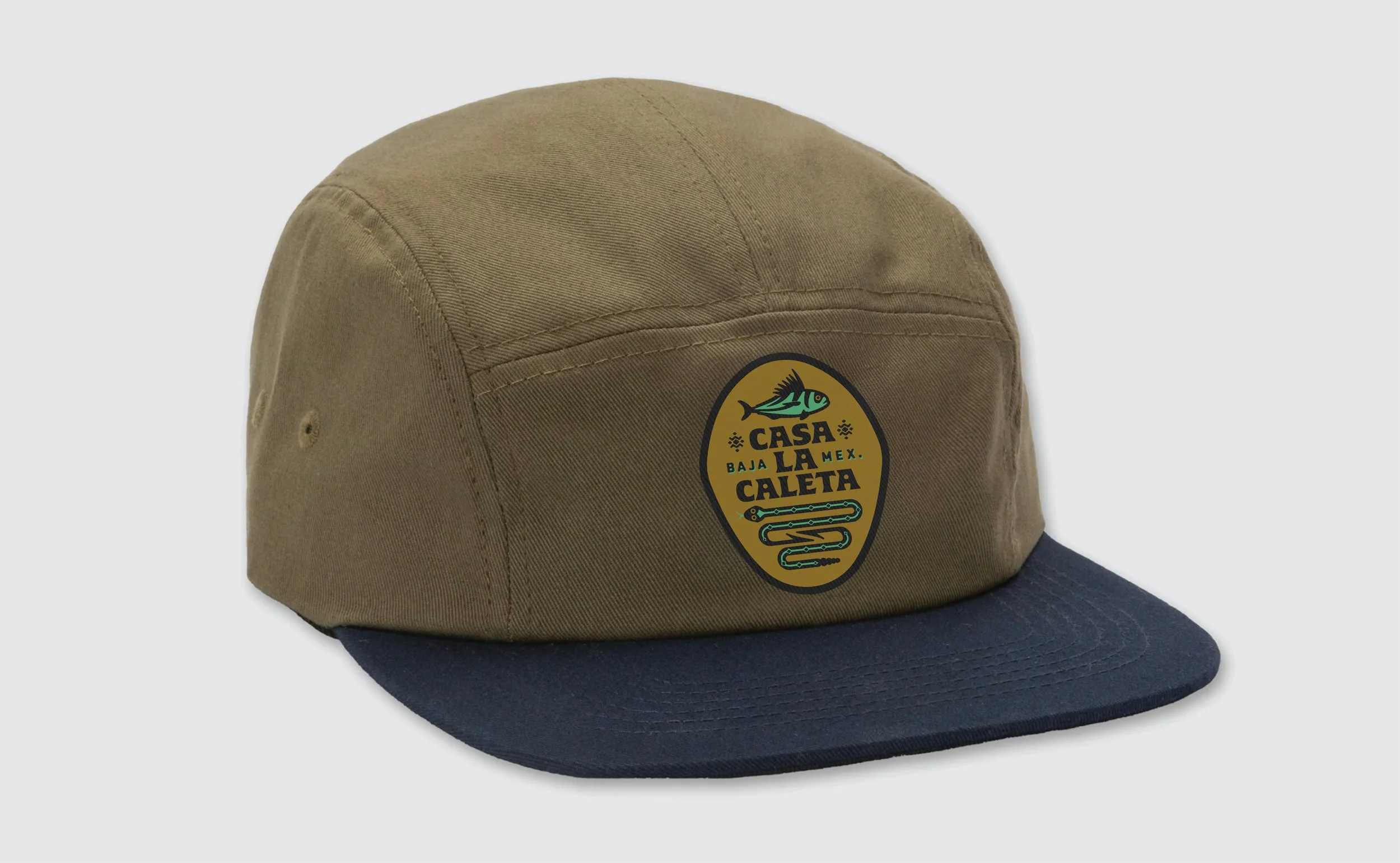
The illustrated style of the logo is playful, slightly off-kilter (just look at those eyes!), and full of spirit. And it is very specific to the feel of Baja. The design is packed with symbols that speak to both the region and the experience anglers can expect at Casa La Caleta. At the top sits the iconic roosterfish, the crown jewel of the area. The typography draws inspiration from a nearby statue, mirroring its bold, stocky proportions. Winding through the logo is a rattlesnake—a nod to the Baja California rattler—with subtle fly fishing references woven into its form: two opposing fishing hooks and a coiled body that mimics the signature “loop” of a fly line in motion. And then there’s the overall shape of the logo—remarkably, it matches both a roosterfish scale and a rattlesnake scale. A natural symmetry that ties the whole design together, grounding it in the land, the sea, and the chase that connects them.
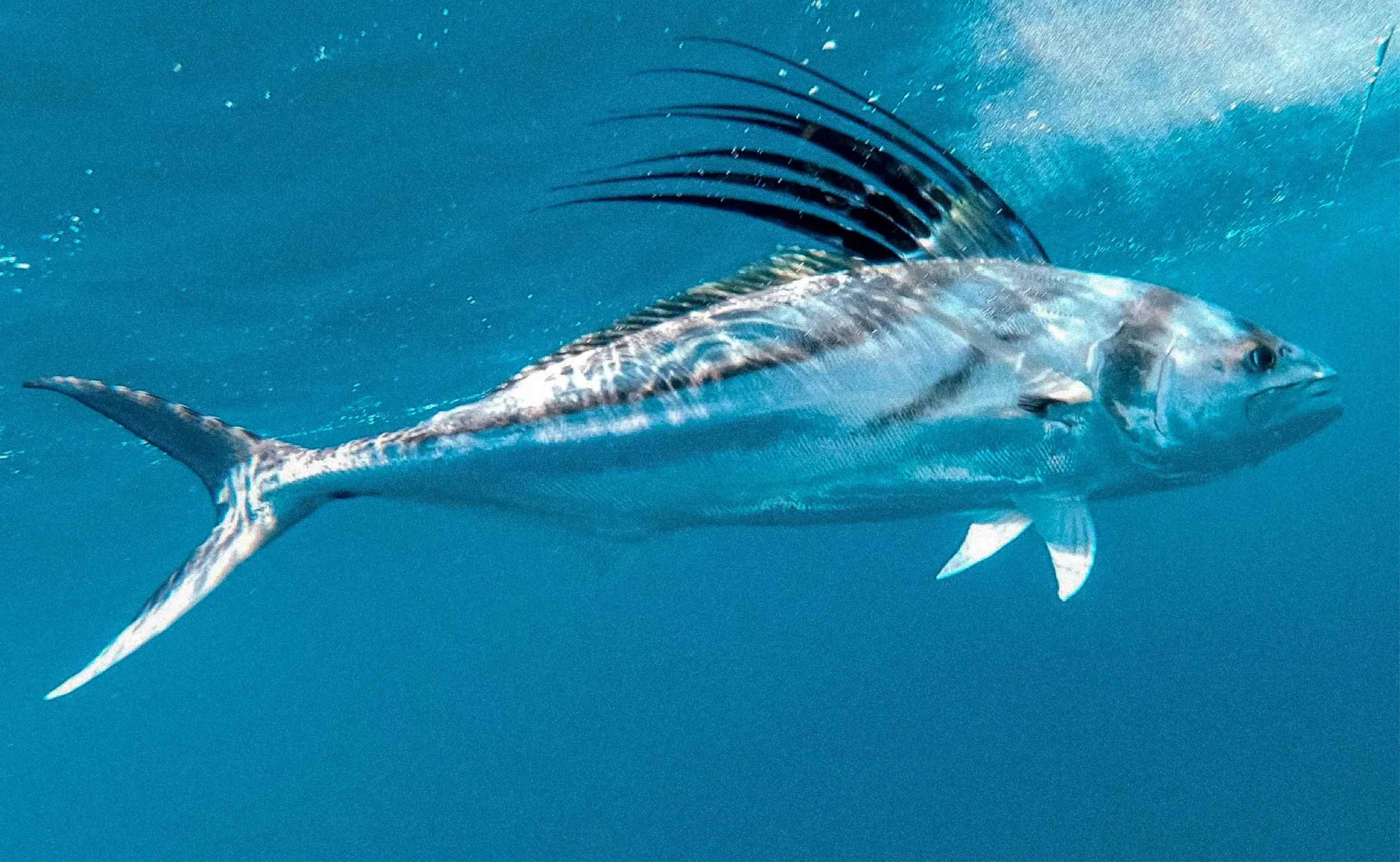
The Roosterfish, a true bucket-list catch, is the most sought-after species at Casa La Caleta.
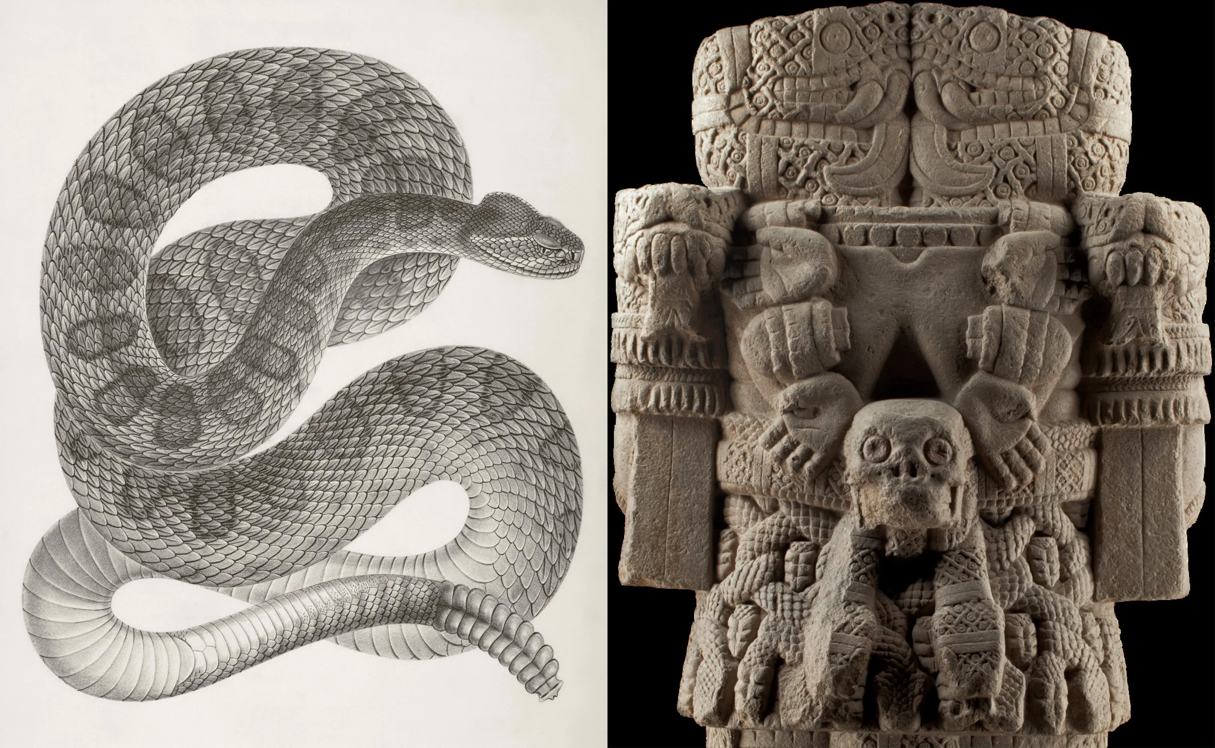
The Baja California rattlesnake is a powerful symbol of the region. Native to the area, this snake held sacred significance for the Aztecs—one of the early civilizations that once inhabited the land.
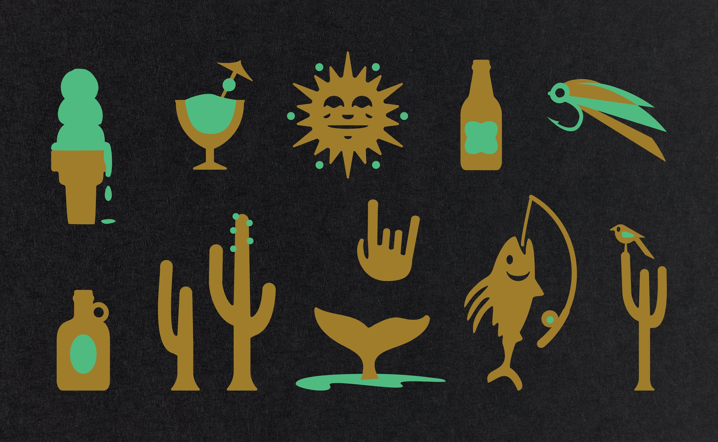
In addition to the primary logo, a more detailed version was designed for merchandise like shirts, stickers, postcards, and wall art. Every element in the design captures a piece of the adventure that awaits at Casa La Caleta.


